

I'm tired of sea grass gray on the wall. I want something with a little more saturation and elegance. I also have to be able to use the furniture I have in my home. Our living room color will have to compliment the rooms that it shares space with - namely our kitchen (dusky French blue) and our dining room (midnight blue - almost black). So we've narrowed the color down to mossy green for the walls with perhaps some black or midnight blue accent colors on the interior doors.
Here is our living room as it stands today:


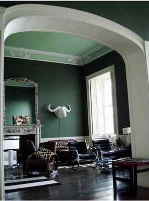
And here is a photo of what I would like the room to feel like.
I think the mossy greens, blues, textiles and red accents will work well in my space.

And here are some other color schemes that speak to me:


Here is the color I'm considering for my living room walls:
 |
| Retro Avocado by Behr |
Thoughts?
Anyone?
Please?
14 comments:
I love the first picture of what you want your room to be like. Such an elegant and inviting space! Can't wait to see your take on this, you have great taste in design!
That color will look gorgeous in that space. Looking forward to seeing it!
I love where you are going with this and your inspiration pic is beautiful. the avocado green could be good. depends if you want a green with lots of yellow or one that is a bit mossier! I saw a great pic of SW inland green recently. time for paint samples!
Suggestion: paint the wall where the thermostat is the same color as your dining room wall. Are you leaving the built in book case wall and the fireplace wall white? I think a deeper than the avocado, maybe a blue/green could be good. Fun!
I agree with the green, the first room especially..I recently went from mostly whites and creams to browns, rose, and greens with touches of cream..though the white on white rooms appeal to me,I had been craving color (sort of English country meets French??)at least that's what I see in my room..lol The green will add the richness you're looking for..good luck! Be sure to post pictures..Marlis
I love the way the lime green walls and accents brighten up the spaces. Also love your new profile pic!
First picture..hands down.. While I haven't seen it in the space, its coming off very khaki to me.. Does it read more green in your home? If you are going to use some red accents then I think it will "green" more. Also love the avocado tone in the library photo. Green really is a neutral so you can't go wrong! Can't wait to see!!
be careful. green is HARD. not because it's not beautiful...but because it LIES!
the light/dark affect it a lot. if your room is darkish i say go brighter. middle of the card, but a brighter hue.
for example more granny smith than avocado. it will actually BE more avocado than granny smith in a darkish room.
if the room is light then you have a bit more wiggle room. but you MUST test. and my rule of thumb is always middle of the card (or mid-tone) for dark rooms.
Okay folks - the more I look at the swatch on my wall, the more it looks like barf. And my mother (who gave me a little decorating advice today) was right - it makes my brown couches look like mud. I'm going to try the blue route. I'll update you all very soon. xo
I love that Miles Redd inspiration room. Good luck with the paint selection - that's always tough. PS have you considered a slightly cleaner green? Maybe Ben Moore's Mesquite?
www.chattafabulous.blogspot.com
I love the first picture, not just for the decor, but those colours are also my preference. I Like the Behr colour you've chosen too. I can't wait to see what it all looks like when you are finished!
I was worried about the couches, too, and was thinking, you might have to recover them if you go with green. Mother knows best, eh? But I admit, the only green rooms I've liked are deep and bluish (not brownish or yellowish). That might work better with your couches and your other rooms, should you go from blue back to green. Matching the color mood (if that's the right word) seems more important than the literal color in getting the flow right between the rooms. A green or blue can be grayish, brownish, yellowish, clear, muddy, warm, cool, etc.
Hi Sarah, firstly, you have impeccable taste and I love your original room- it looks very similar to the first pic of what you want to change it to- do you really need to change it? I have to say that swatch of green looks very muddy/dirty and perhaps a clearer green would be better. Be careful as when you change and repaint walls suddenly everything else needs to change too and you are up for new curtains/lounge etc. I can't get past an all white scheme where you use artworks and soft furnishings to change the look-in winter use warm colours in summer cool, clear and bright. I probably haven't helped much at all! PS I have been guilty of a little persuasion of my husband- isn't it our female perogitive?!! XX Corrina.
I am in love with your textile pillows and your chevron pouf!
Post a Comment